Summer’s in full swing, which hopefully means plenty of pool and beach time for many of you. Whenever I’m working with a homeowner who wants to add some color to their home, but doesn’t necessarily want to travel down the bold road, I recommend watery blue hues — colors inspired by summertime spent by the sea.
These soft, muted greenish-blue hues work especially well for bedrooms and bathrooms, where they offer a calming, spa-inspired vibe. I’ve gathered together some paint color options as well as examples of how to work with this pleasing, ocean-inspired hue.
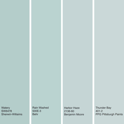
Our featured color is a soft blue that has green and gray undertones. Because of its softness, it can be used in large quantities in a room without being overwhelming.
Some of my favorite watery blue paint colors are, from left to right: Watery from Sherwin-Williams, Rain Washed from Behr, Harbor Haze from Benjamin Moore and Thunder Bayfrom PPG Pittsburgh Paints.
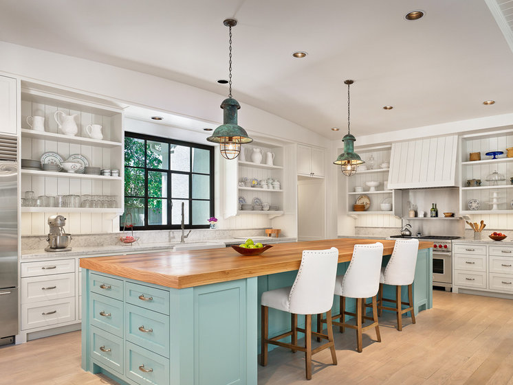
White, light and neutral kitchens remain popular, but I always like to see a splash of color included somewhere in the space. This helps break up the monotony and makes your kitchen stand out just a bit from all the others. The soft watery blue hue on this island is a terrific choice as it contrasts nicely with the beautiful butcher block top.
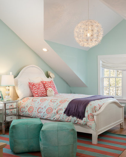
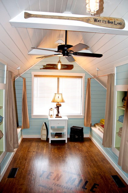
Watery blue hues are among my favorites for bedrooms. Blue can be such a calming color, and these muted watery blues offer just the right dash of color while remaining sedate. If you have trouble getting a good night’s rest, consider using our featured hue to set the tone for some solid sleep.
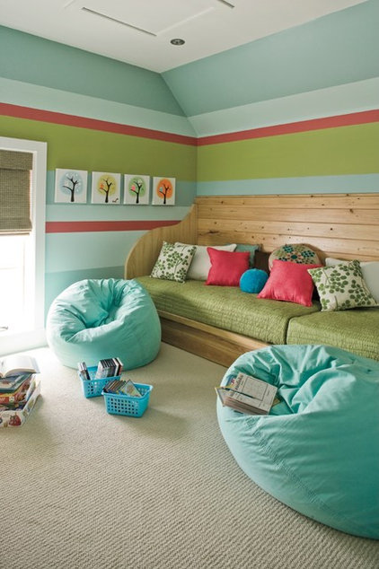
A light watery blue plays well with a variety of colors, from soft neutrals to bold, electric hues. This room is much more high-energy than the previous one, but the soft blue is a nice grounding color to the more vibrant hues in the space.
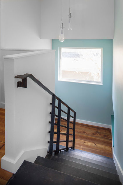
Cool colors tend to visually recede, so they are a great choice in a small space — such as a stairway or hallway — to make it feel more expansive. What I like about our featured color is that even if your particular room or space lacks abundant natural light, these hues are soft enough that they will never cause it to feel closed in or cave-like.
Blue and orange are complementary colors: They sit opposite each other on the color wheel. This means they offer the most contrast to each other. So the best way to show off interesting hardwood floors or other wood elements in a space is to use blue as a contrasting color. It plays up the orange tones in wood and makes it really stand out.
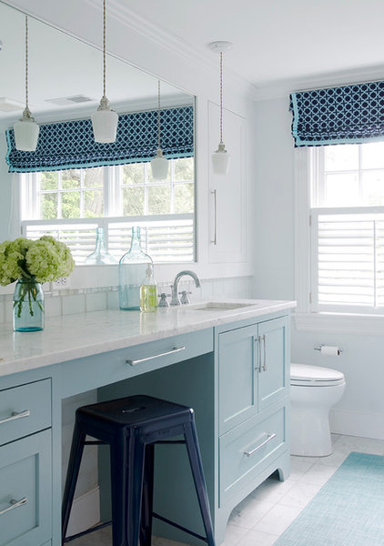
Think about layering blues in a space, such as combining dramatic navy with our featured hue. By staying within one color family you can easily add more elements while still keeping the palette harmonious. Just keep an eye on the undertones of the blues — slight shifts in hue can be tough to notice until you place various blues next to one another. Some may appear cooler, or more purple, while others veer more toward green or yellow. Two light blues that differ vastly in undertones can clash when used together in a space.
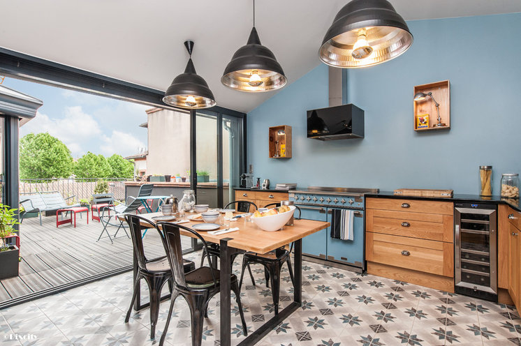
A soft blue accent wall is a terrific way to help bring the outdoors in. It also creates a focal point that doesn’t necessarily hit you over the head. There’s lots to like in this kitchen, and I think color is expertly used to pull it all together.
read more…
http://www.houzz.com/ideabooks/44309088

