When modern and contemporary architecture “abandon” traditional architectural elements in favor of new forms, one of the elements left behind is the bay window. Yet if we think of these elements as reinterpretations of traditions in architecture rather than abandonments (columns, for example, are turned into skinny pilotis without details like capitals), then the idea of the bay window is alive and well, if less used than it should be.
Here you’ll find six examples that show the benefits of modern answers to bay windows — increased area, light and seating capacity — and the various means of expressing the idea in modern houses and in modern renovations of old houses.
New plays on bay windows are boldly branching out in modern architecture | Bedford Hills NY Homes
Leave a reply
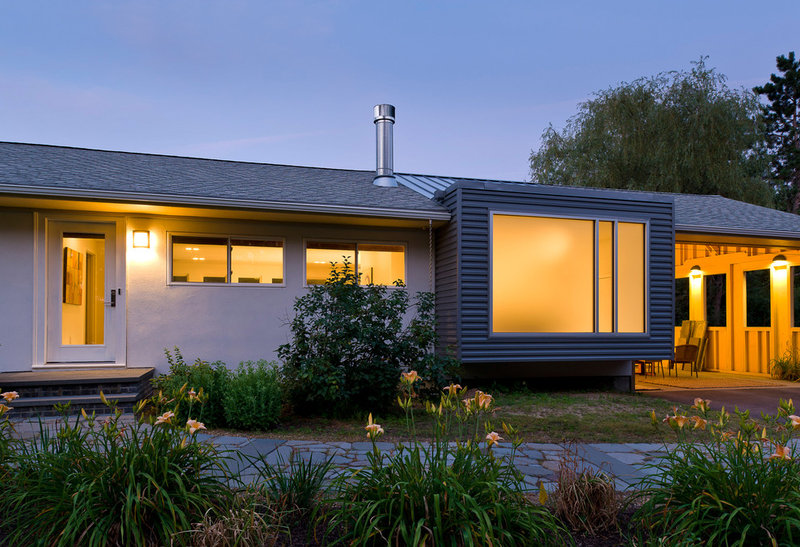
This addition to a ranch house looks like the end of a square tube that runs from front to back, with large windows on each side. The front picture window is partially frosted to maintain privacy.
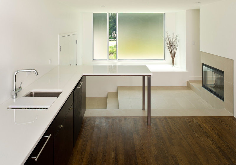
Here we are looking toward the front window from the kitchen before it was furnished. Only one thin strip of glass is clear; the adjacent pieces are translucent. Adding cushions to the bay would make it a great window seat; one could peek outside through the vertical strip or just enjoy the light coming in through the painting-like panes of color.
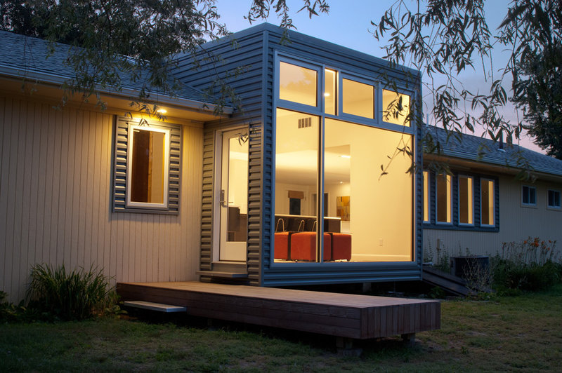
Like the front window, the back window projects from the house, cantilevered a foot or two above the ground. But unlike on the the front, all the glass here is clear, and the area inside is an extension of the floor, giving more space for seating near the kitchen.
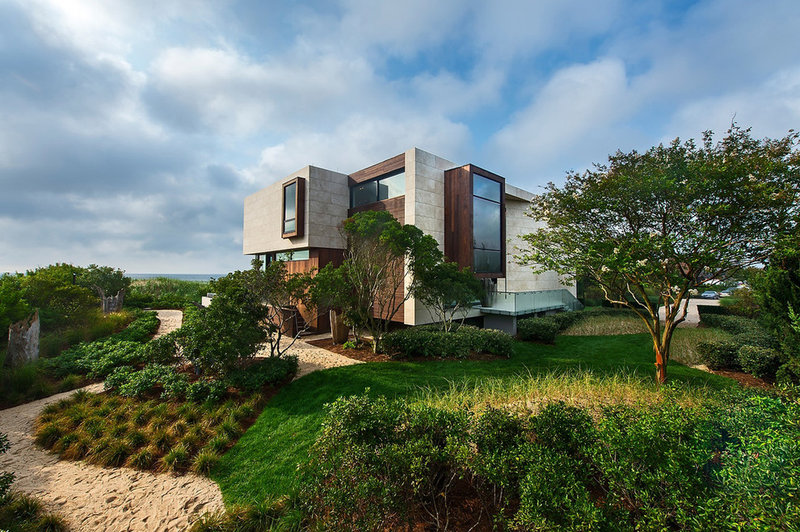
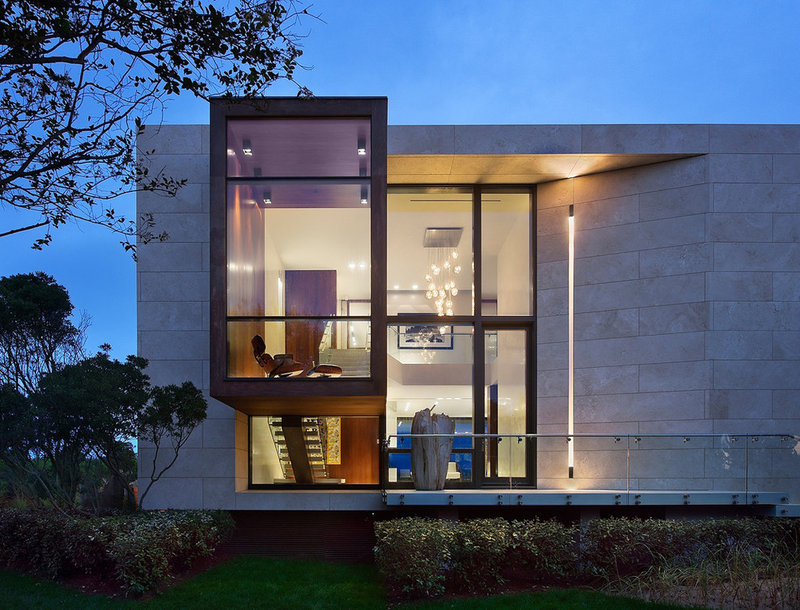
This house on New York’s Long Island has a fair amount of ins and outs on its exterior. I’m drawn to the tall portion facing right.
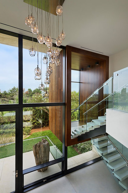
A view from the side reveals a tall bay window adjacent to a section of curtain wall set back from the stone facade. A stair can be seen below the large bay window.
It turns out the bay window is actually an extension of the stair landing. The Eames Lounge Chair in the previous photo indicates that this space is ideal for sitting, relaxing and enjoying the view.
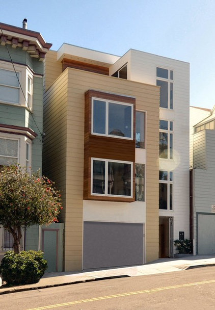
On a more modest scale is this two-unit condo in San Francisco, with modern bay windows above the garage.
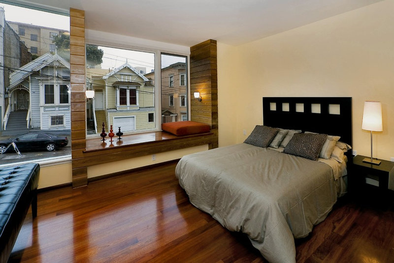
What looks fairly subtle on the outside is impressive on the inside, owing to the relative size of the window (almost the full width of the bedroom) and the way the architect articulated the window seat. The only thing I would change for myself would be the height of the sconces, which appear to be head height, making it hard for someone to lean against the walls while occupying the window seat.

