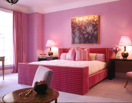
We’re taught from an early age that overindulgence is a bad thing. But sometimes it can be very, very good.
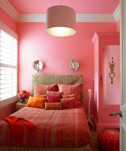
Repeating a single color throughout an entire room can be not only beautiful, but relatively easy to pull off. No worrying about whether the curtains go with the carpet. When everything’s the same color, it’s usually a match.
Granted, the look can be overwhelming. It works best in contained spaces where you don’t spend a lot of waking hours, such as a bedroom. And while it’s possible to match the color precisely in every detail, it’s better (and easier) to vary the shade a bit — in terms of both hue and intensity, and texture and sheen. That keeps the repetition interesting.
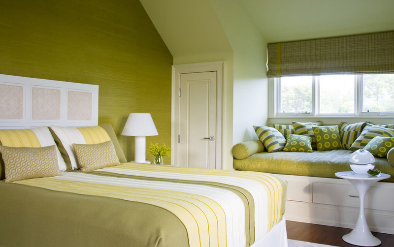
One of the appealing things about a monochromatic interior is that colors you’d think would be too overpowering on their own become more demure when used en masse. The sheer quantity dilutes their ability to shock and makes even a strong color, like acid green, feel restful. When working with bright colors, be mindful of the amount of light the room gets: This space could be blinding if it got a lot of intense, direct sun. |
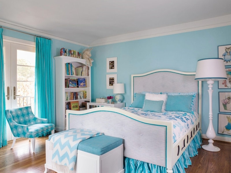
Although the patterns in this girl’s room don’t match, they all work together because they share a common color. Liberal additions of white prevent the blue from overwhelming the space and add to the tranquil atmosphere. |
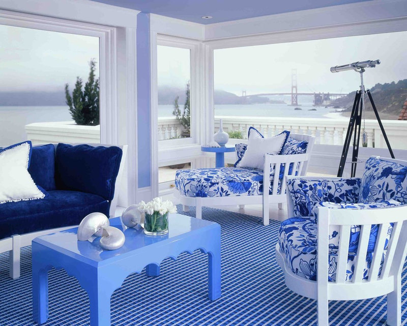
The combo of blue and white is a seaside staple. But in this San Francisco home, the variations in hue and solid planes of color banish some of the sweetness, making the scheme feel fresh and more contemporary. |

